Oil Pastels
Oil pastels are a painting and drawing medium composed of pigment mixed with a non-drying oil and wax binder, resulting in a creamy, crayon-like stick that produces vibrant, opaque colours. Unlike soft pastels, they do not produce dust, never fully dry, and can be used on various surfaces to create thick impasto textures.
It’s easy to get confused between oil pastels and the other type of pastel - soft pastel. Both pastels offer beautiful appearances and both are actually soft providing an easy application, but each are very different in nature. Soft pastels are sometimes mistakenly referred to as “chalk pastel”, but “soft pastel” is the correct term. Both oil and soft pastels are available in small size pieces or chunks about 1″ to 2″ in length, and about 1/2″ thick.
Soft pastels consist mostly of pigment loosely held together with a small amount of binder. They are substantial and strong when you use them but create a delicate surface especially when working with many layers. These are most durable when used on toothy surfaces which can grab the pigment particles holding them in place and will not work at all on smooth glossy surfaces. The pigments in the soft pastels refract light in a way that no other medium does. This makes for vivid colours and a very attractive surface quality. The best way to protect a pastel painting is to frame it behind glass. Spraying with fixative will often remove white and light-coloured soft pastel.
Oil pastels are very different than soft pastels but also provide a beautiful surface sheen. Oil pastels have a lovely creamy quality when applied to a surface, feeling and looking somewhere between lipstick and crayon. They are made with wax and oil, so they always stay workable even after years, but do dry enough to be stable, and stay on the surface well. Since they are always workable it is recommended to either frame them behind glass or spray fix them with any clear fixative when your image is finished. Oil pastels can be applied on just about any surface, whether absorbent or non-absorbent, matte or glossy, smooth or textured, painted or unpainted.
Source: Nancy Reyner - Oil Pastels: A Versatile Medium for Painters
History
To understand the purpose and versatility of oil pastels, it’s important to understand a little bit about their history. Oil pastels were first created by Sakura in 1925 and called Cray-Pas, which are still prevalent in classrooms today. They were a combination of wax, oil, and pigment that was meant to be non-toxic like crayons and suitable for children. Nearly thirty years later, in 1949, Henri Sennelier would invent an artist-grade oil pastel at the request of Pablo Picasso. Artists like Picasso were drawn to the accessibility of the Cray-Pas material but wanted something that better met their needs. They wanted to be able to travel with this medium while still achieving the painterly effects of oil paint. Thus, Sennelier Oil Pastels were born.
Source: The Art of Education - A New Way to Look at Oil Pastels
Documentry of my own Artpieces
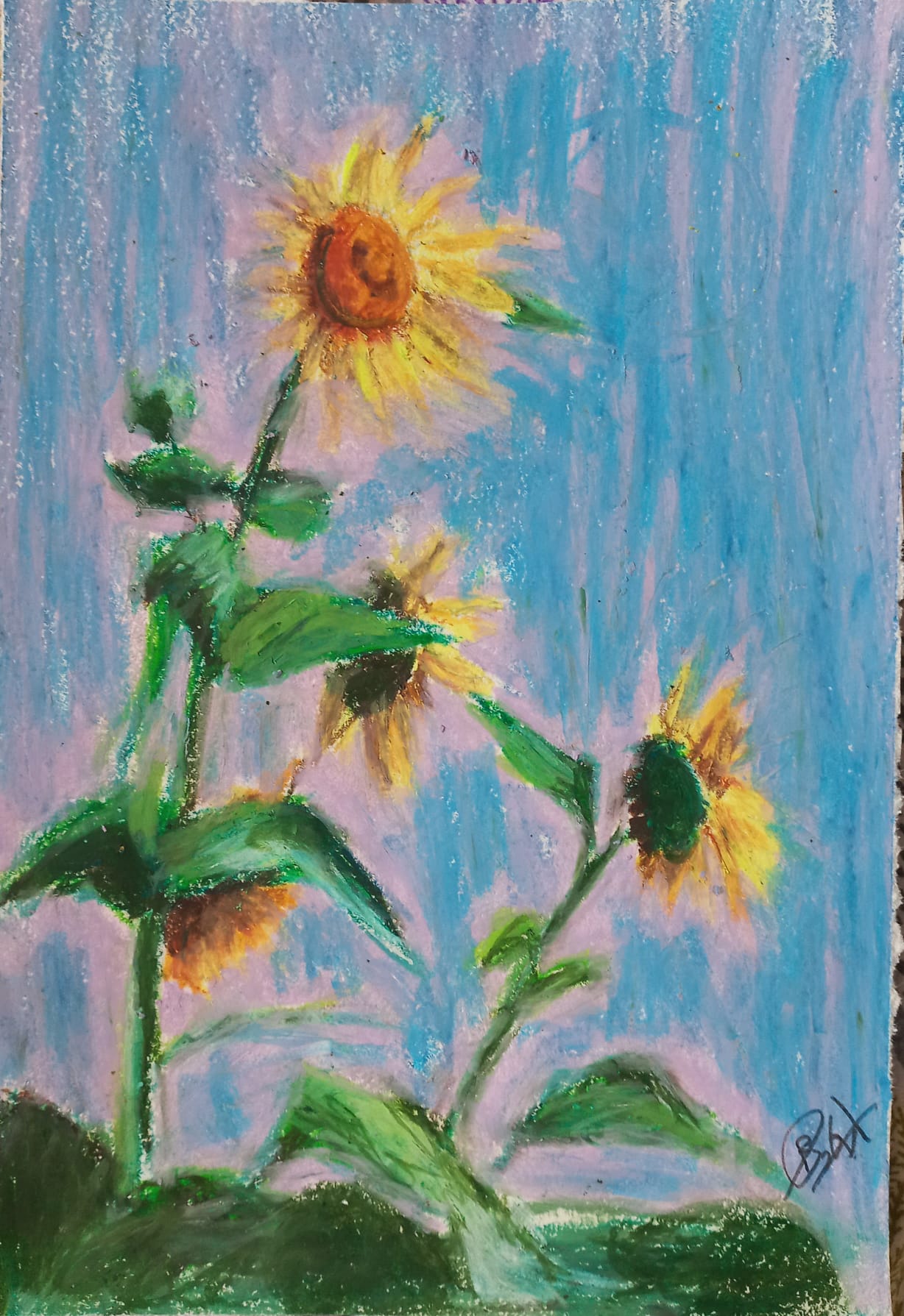
“Sunflowers”
The medium of this art piece is oil pastels and the surface I have used is an A4 sketching paper.
Materials I have used are:
- Mechanical Pencil
- Eraser
- Sharpener
- Oil pastels
- 160GSM A4 sketching paper
For a long time, I thought of oil pastels mainly as a simple colouring medium for children, and I did not fully understand how effective they could be for creating serious and expressive artwork. Working on this piece changed that view completely. This artwork was created using oil pastels on sketching paper, and it gave me the opportunity to explore the medium in a more thoughtful and creative way. As I worked, I began to appreciate how rich, soft, and vibrant oil pastels can be, especially when they are blended and layered carefully.
This artwork was mainly an experiment that helped me become more familiar with oil pastels rather than a piece based on a deep personal story. Even so, it became a valuable study of color, texture, and blending. The subject of the artwork is a group of sunflowers, and I wanted to capture their bold shapes, bright yellow petals, and the warmth they naturally bring to the composition. Looking at the finished piece, one of the most noticeable features is the strong use of color. The yellow and orange tones in the petals help the flowers stand out clearly, while the darker centers create contrast and draw attention to the middle of each sunflower. Another important technique in this work is layering. By building up several layers of color, I was able to create richer tones, smoother blending, and a stronger sense of depth. This process also helped the petals and leaves look more textured and natural. Overall, this artwork allowed me to explore the creative possibilities of oil pastels and helped me understand the medium much better through practice.
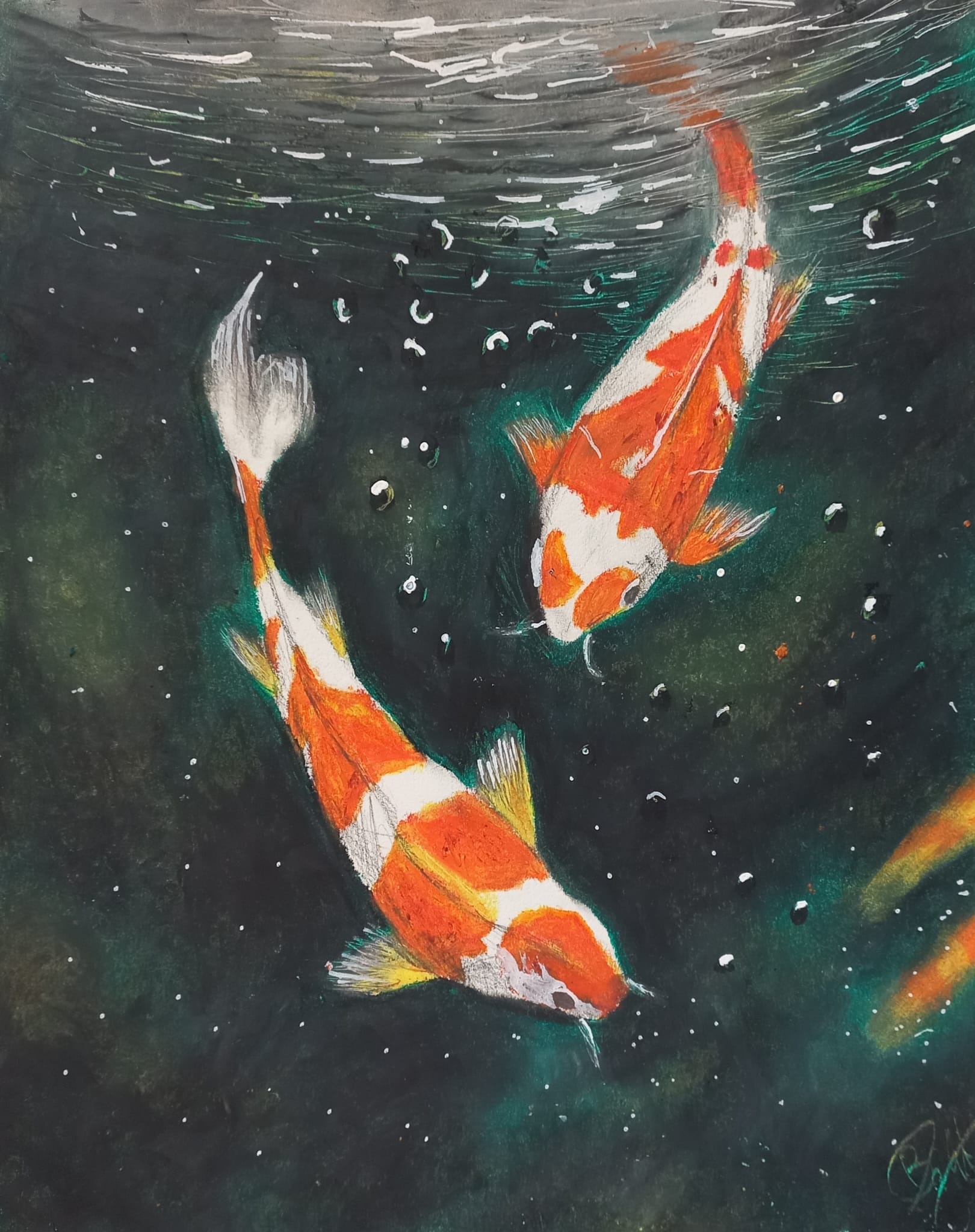
“Underneath”
In this artwork, I wanted to fully explore the possibilities of oil pastels and see how far I could push the medium when creating a more detailed and visually ambitious piece. The artwork shows two koi fish swimming beneath the surface of the water, and I chose to present the scene from an underwater point of view so that the viewer feels as if they are inside the water, looking up at the fish and the movement above them. This perspective makes the composition more interesting and helps create a stronger sense of depth and atmosphere.
By using a range of different techniques, I was able to capture the flowing movement and appearance of the fish more effectively. For example, I used graphite pencils to add depth and definition to parts of the koi, helping their forms stand out more clearly. Additionally, I also used Posca markers to add strong highlights across the artwork, which helped suggest the way light reflects and flickers through water.
One of the most time-consuming parts of the piece was the background. It required layering large areas of color across the page and then blending each section carefully and patiently with a cotton bud in order to create a smooth underwater effect. To strengthen the illusion of the water’s surface, I also used a palette knife near the top of the artwork to create ripple-like marks. These details helped exaggerate the surface movement and made the overall piece feel more dynamic, textured, and realistic.